One of our first ports of call within our project was to create a logo, and who better to employ as our logo designers than our budding designers, the pupils of Kilmodan Primary School!
During one of our first workshops, we explored what makes a good logo, identified some famous logos we see regularly, went on a ‘logo hunt’ around the school, and highlighted areas of the design process that must be addressed to create the most eye-catching logo possible.
The pupils came up with 5 guidelines for designing their logo:
1. Make a list of the most important things about the Glen, that should be included in the logo, including iconic points from the timeline.
2. Make it interesting to look at, but not too busy and difficult to work out.
3. Think about colour – bright, eye-catching, bold colours.
4. Make sure your design can also be produced in black and white, as colour print can be very expensive.
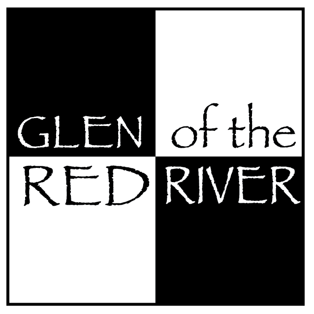
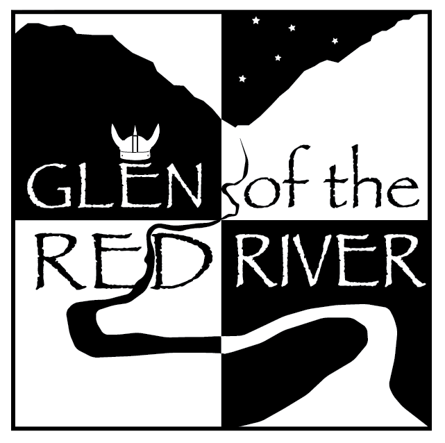
5. The title of the project “Glen of the Red River” must be included in the logo.
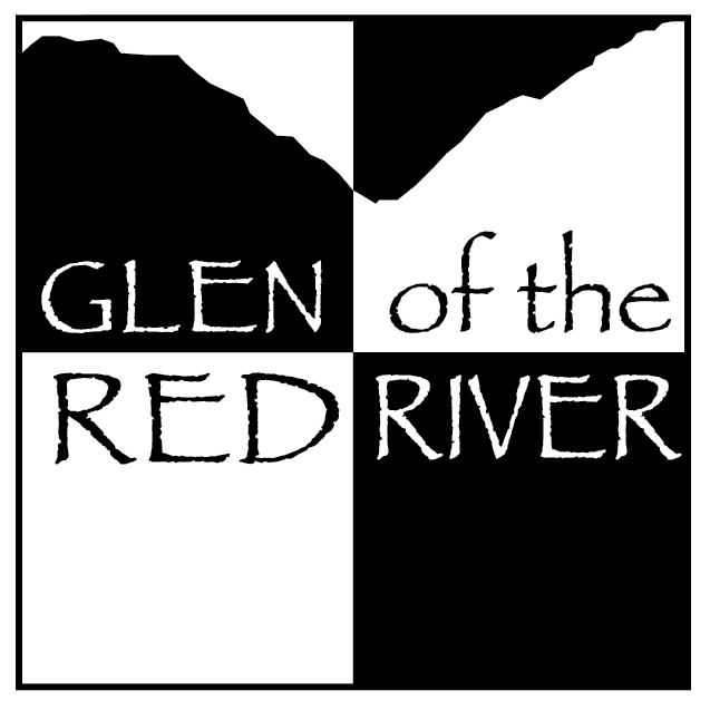
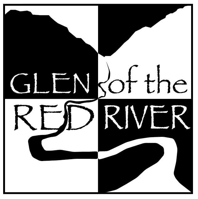
With their guidelines written on the white-board, the pupils were then set with a task. Each pupil was given an A5 piece of paper, one coloured pen/pencil, and 5 minutes to design a logo. They were to work on their own, and design a logo without putting too much planning into it. We wanted to gather their initial thoughts and sketches and see what they came up with. Below are a few of the 5 minute sketches that were used in the creation of the final logo, and the aspects of each which were chosen by our web designer:
When their five minutes were up, the pupils did not seem convinced that the sketches they had drawn could be made into a logo! Our web-designer proved them wrong!
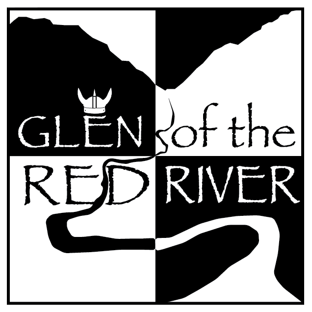
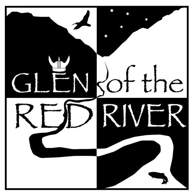
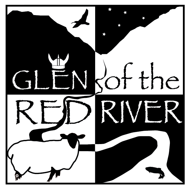
The pupils couldn’t believe how the designer had taken their 5 minute sketches and created such an interesting logo for the project with them! The next stage – colour! Once again, we turned to our Kilmodan Pupils, and set them the task of choosing the logo’s colours! Each pupil was given a black and white version of one quarter of the logo, and given the task of choosing which colours were to be used (we gave them a bit longer than 5 minutes this time!). When all coloured pictures were gathered in, they were put into bundles, and in groups, the pupils chose their favourite four quarters. With the final three coloured logos laid out, it was time to a vote….and our winner is…
Our colourful logo was then given to our web-designer, who was thrilled, and made our paper-dream, a digital-reality!!
And there we have it, the journey of a logo, by Kilmodan Primary School!